Molding and green paint freshen up a Victorian Guest Room
It’s easy being Green!

I couldn’t convince clients to use grey paint seven years ago. Wow, has that changed! I still think it is one of the most versatile colors for interiors but sometimes it’s just too drab for a home. Case in point - Our 1908 Kansas City Shirtwaist.
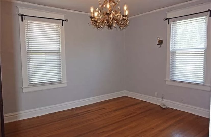
This is our smaller guest room painted in a blue grey. Yawn. All the rooms in the house are named after early 1900 slang. It’s fun history and an easy way to describe the spaces as I share the remodel. This is “The Dilly” and to live up to her name this bedroom needs to be remarkable and unusual.
Since moving into Angell 1908 I’ve become obsessed with 2 things: the color green and molding. Yes, mold can be green, so let me clarify. I tried numerous shades of beige and tan paint in this house resulting in depressing Poo-colored swatches all over the walls. I own enough sample pots to open my own paint store. But while I am analyzing the latest version of Greige hoping to be thrilled, inspiration is staring right back at me.

The original tile. One of the reasons we bought this house. Goodbye neutral paint. I don’t know why I make things so hard?
I research Victorian homes and ways to modernize the style. We decided early on to honor the history but also not live in a stodgy museum. An element I immediately gravitate toward during my Pinterest dive is the use of decorative molding, especially the ones painted rich colors. Plus my dad gave me a nailer for Christmas that I am both excited and scared to use. This seems like a good practice project.

Armed with the barest of You-Tube knowledge, I design the molding layout for The Dilly. I have destroyed several walls in the lower level making it easy for me to measure the distance between wall studs. I also see all the old knob and tube we need to replace every time the electricians come back. Anyway….If I am hoping to hit a stud (and who isn’t?) with the nailer, then I need to measure 16 inches for each vertical molding strip.

Ok, let’s address my hand because that bandage shows up in every picture. It is not a fashion statement but a lesson in how NOT to clean a glass tabletop. Do not force a sharp razor blade over a bump of dried epoxy with your opposite hand open on the other side of the bump. Save yourself from getting stitches. You’re welcome!
Back to measuring. Working out from the corner, I mark 16 inches where I will center the wood strips. Then I measure up 4 feet. This is the height of the molding I want to use.

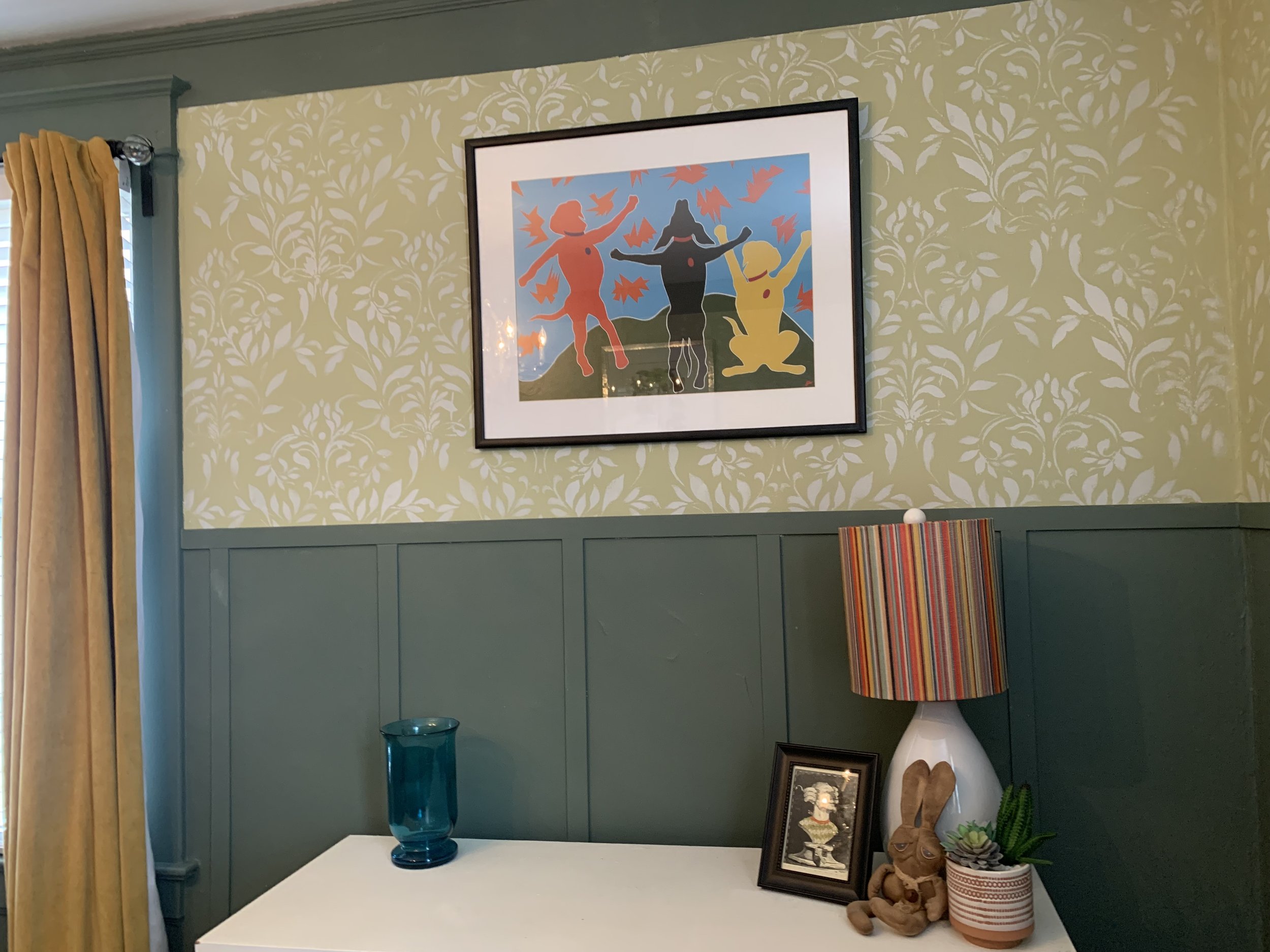
I use a level to create the line for two paint colors. Patterns are my thing so I’m using a stencil on the upper section to mimic floral wallpaper.

I debated several pieces of wood molding at the home improvement store before settling on thin lattice strips. They were 8 feet tall giving me two pieces per strip and flimsy enough I could liquid nail them to the wall thus avoiding the nailer until a later date (that date being when my pops comes to KC and shows me how to use it!)

Caulk comes in handy when the plaster walls are not flat. It finishes off the edges giving the molding a more professional look and serves to fill larger gaps. I did not apply the final horizontal molding piece yet because of the pattern. Trust me, it is easier to apply a stencil with fewer unmovable things to work around. The pattern can be raggedy at the bottom because the molding will hide it. One instance where I am not making things harder - progress!

Paint color selections are overwhelming, especially when planning a whole house makeover. It’s nice when you may pull a palette from a single paint line. I stumbled on the Magnolia Paint line at my local Ace Hardware. Now I gave a hard eye roll when I read the Gaines’ were creating a paint line. But shut my mouth! The line is curated with charming colors. And the paint, made by Kilz, covers really well even in dark colors.
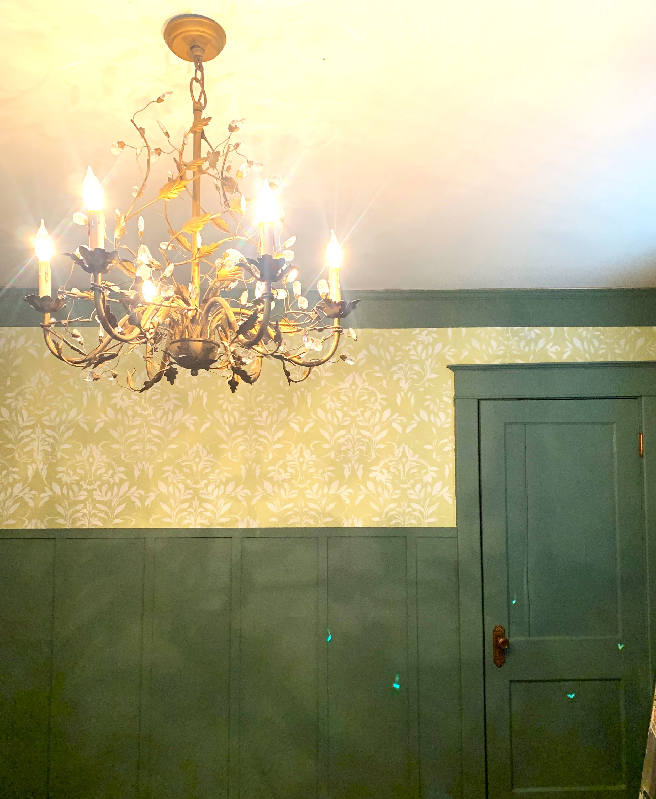
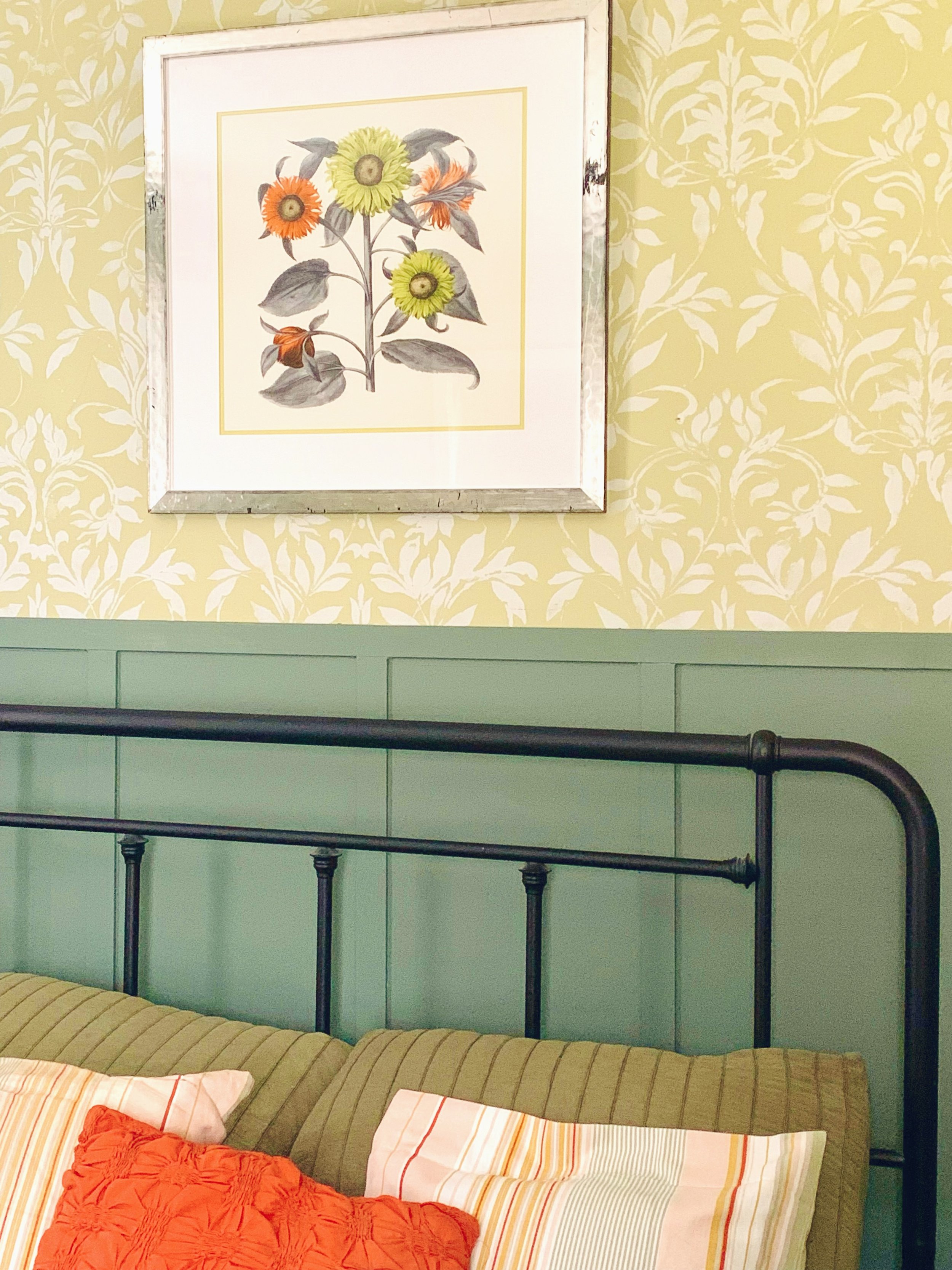
I selected Luxe for the lower sections and Sour Apple for the upper 1/3. Want to get people riled up? Tell them you are painting wood in a historic home. Look, I get the argument on both sides but “just because it’s wood doesn’t mean it’s good.” I stole this from Christopher Lowell, remember him? Half the wood in our home is painted (poorly) and the other half is stained (also poorly). Where it is possibly and makes sense, I will strip the ugly stain and refinish. But the bedrooms have the biggest hodge podge of paint and stain. Many of the Victorian inspirational rooms also had the molding painted the same rich color as the walls. So Luxe went on the baseboard, doors and window casings.
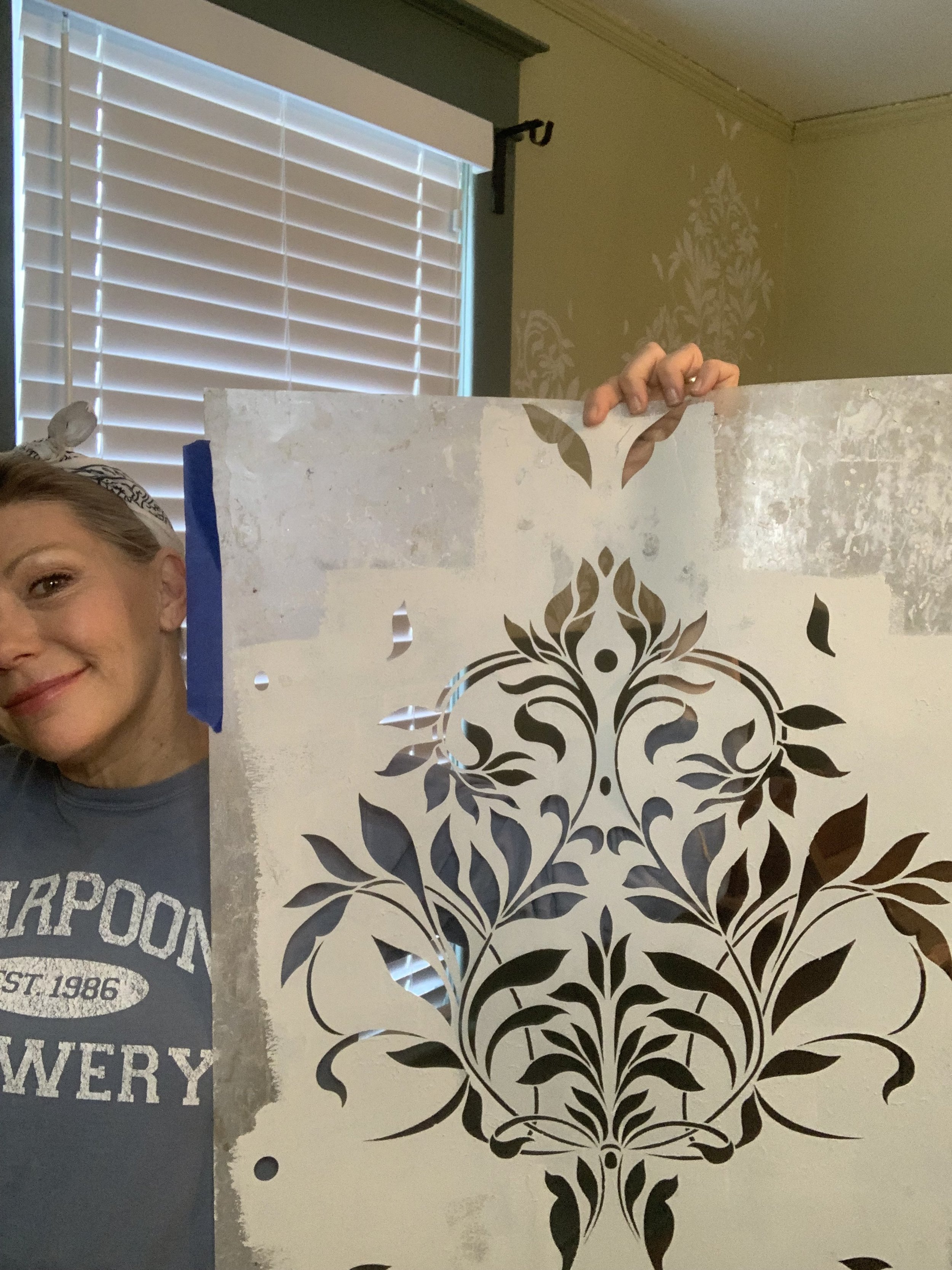
This is a much beloved stencil from Wallovers. It uses a “window” match to repeat the pattern. See those rabbit ears at the top and the holes to the side? Those match elements in the pattern. I find window matches much easier to work with than registration marks at the edge of a stencil sheet. I selected this pattern because it reminds me of the delicate bronze gold chandelier in the room.

I started my stencil where I would see the whole pattern in a complete line, using a level to keep it straight. The paint, a left over quart of a mid-tone blue grey, is applied with a big round stencil brush. Rather then smack it over the pattern, I swirl it to control opacity/fade. Most stencil companies have good videos to show this technique. I taped the horizontal molding to check I was going down far enough on the wall.
Corners and upper edges are difficult to keep neat. I get the complete patterns done in the whole room and then cut the stencil up into smaller manageable pieces. Yes. I can’t use the stencil again but it saves me hours of frustration.
The top molding is not straight and I had those weird rabbit ears in my pattern. Painting in a boarder at the top solved this problem and gave the stencil a crisp frame.

Now the fun part, decorating! I found this antique drop down desk at a local consignment store. It’s a different way to provide a bedside table with space for water, a book and a lamp, and a spot to display collections.

Aren’t these old wool gloves great? They caught my eye at an antique mall because the colors match the outside of our house. The artist recycles old pieces with her embroidery and mounted these in the original glove boxes she lined with colorful felt. Clever! She also embroidered the small black & white painting below.

Bummed Out Bunny is made from an old coffee bag. He smells good although he doesn’t look happy.
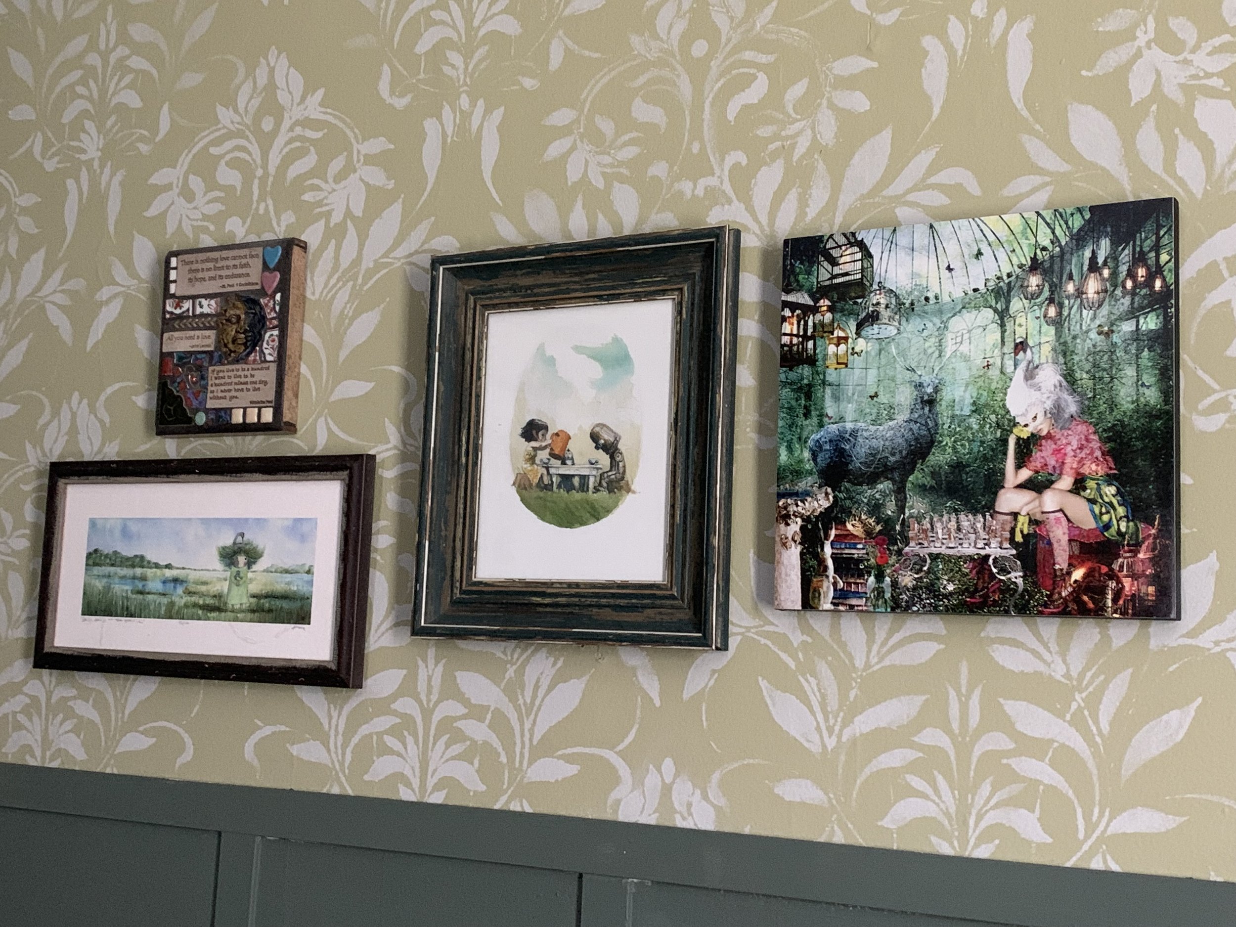
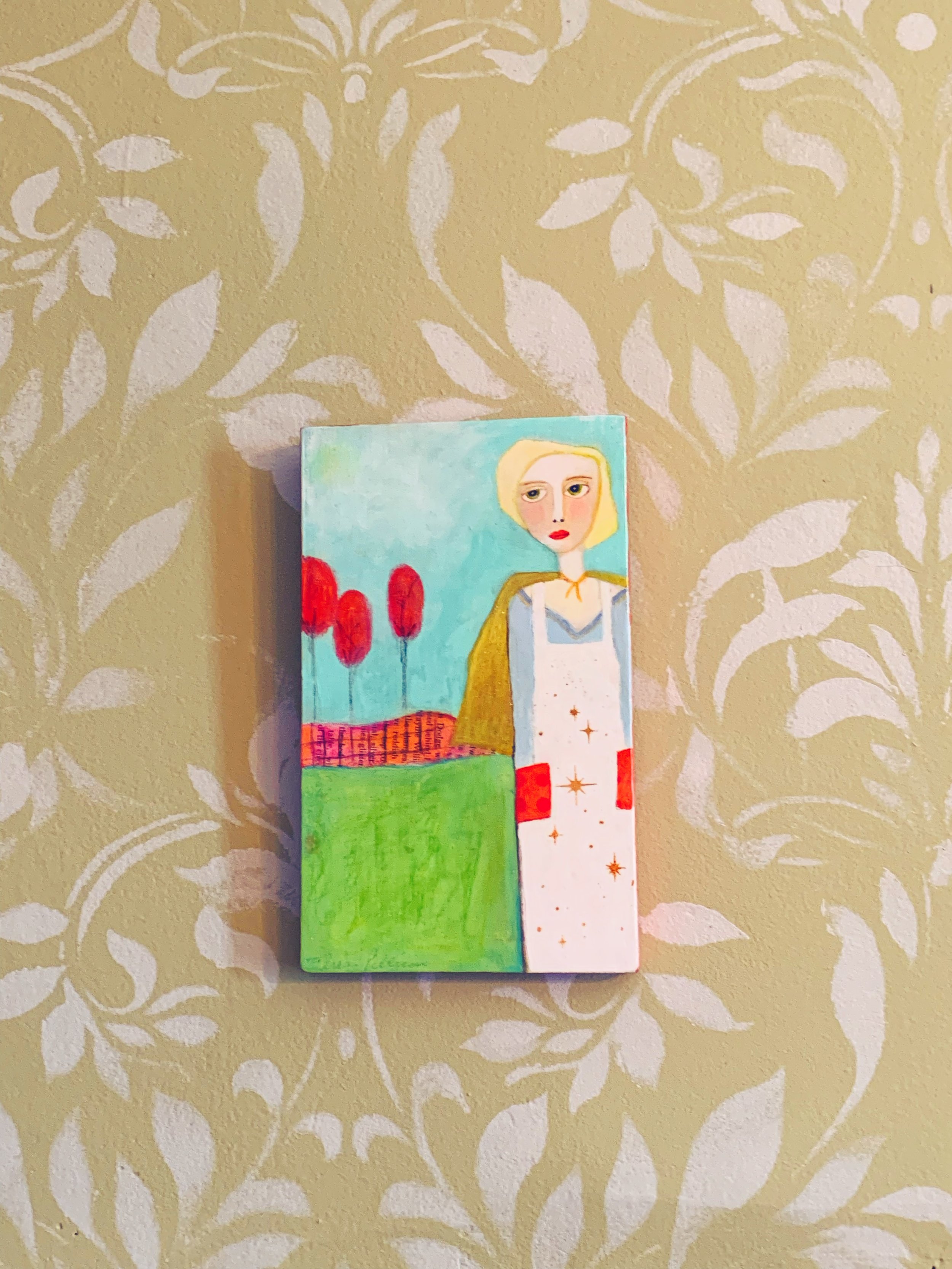
I enjoy hanging art the most. Before I remodel any room, I place artwork in the space and live with it, watching how it reflects the character I want to convey. once I settle on the right piece in the right room, I have a color story to work from.
Most of our pieces come from our travels. Nothing fancy, but meaningful to us. We get to relive the story behind the providence when visitors inquiry about the piece. The Overall Super Hero was from our honeymoon stop in Eureka Springs, Arkansas and reminded us of someone we know.

Mustard Gold is a color I am using throughout the house. This room gets it in velvet drapes from Wayfair.

I am mixing mid-century pieces with my Modern Victorian vibe. The two styles just seem to work together for me. Here I painted a mid-century dresser a clean white. An embroidered green comforter. An area rug, New towels in a basket. And fresh flowers. That’s it! I need to refinish the floors and add little do-dads like a mirror but we are ready to host guests.
The project took 13 8’ lattice pieces, 2 gallons of paint, a quart of paint, a stencil, caulk, liquid nails, and basic painting supplies. All supplies were under $300 and time invested was a Friday-Sunday.
Tell me what you think? All complaints of painting the wood should be noted on the Memo line of a check made out to me in the amount of $1. Thanks!